Hello scrappers! CT member Cheryl here to bring you another tutorial. We've had some requests to do a tutorial on "LEADING", so I'm going to talk about that today. Leading (it's pronounced "LEDDING") is simply the amount of space between the rows of type. It harkens back to the "old days" when individual letters were set by hand. Between each row of letters, there were strips of leading ("ledding") and when put in the printing press, it controlled the amount of space between the rows and made the type easier to read. The larger the "leading", the further apart the rows of type would be.
First of all, let me show you where the leading control is in Photoshop Elements, which I'm using. When you click on the type tool, a dialogue box opens, and the leading control is just below the font size. My leading is set to "Auto" and I'll explain more about that as we go along.

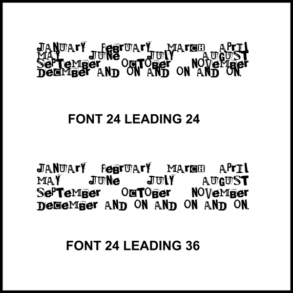
Let's see if my first example helps clear this leading thing up. I just typed some random words - i.e. the months of the year, showing the same font size, with two different leading sizes. You can easily see how much further apart the lines are, with the higher leading size.
As I mentioned above, "leading" is normally set to "auto". So, you'll have to change your leading size accordingly. It's often a trial-and-error thing. My "auto" is set to 24, but yours might be different.
Now that you know what leading is, let me show you some examples on a journal card. I'm using a card from the Pink Reptile Design's Botanica Kit, which can be found here in The Sweet Shoppe Designs Store:
https://www.sweetshoppedesigns.com/sweetshoppe/product.php?productid=52586&cat=&page=1
I just typed up a little something on this card to show you how leading changes the look of your type. I used font size 18 and leading size 18.